10X Visium Spatial Transcriptomics Analysis Report
| Contract Information | Contract Content |
|---|---|
| Project Number | NovogeneST_MouseBrain |
| Project Name | Spatial Transcriptomics Analysis Report (Mouse Brain Tissue) |
| Report Date | 2020-07-23 |
| Report Number | NovogeneST_MouseBrain |
1 Experimental Workflow
The 10x Genomics VisiumTM spatial transcriptomics is an unbiased detection of gene expression based on intact tissue sections. This technology retains the histological information of the sample by performing H&E staining and imaging on frozen sections placed in specific capture areas on the slide. Subsequently, through permeabilization of the same sample, the RNA is released and hybridizes with the oligonucleotide probes in the capture area, allowing different spots to be labeled with spatial barcodes. The 10X Visium spatial transcriptomics integrates gene expression activity with histological information, presenting a new view of the complexity of tissues and gene expression. The core of the 10X Visium spatial gene expression technology lies in the spatial barcode slide, and the technical principle is specifically demonstrated as follows:
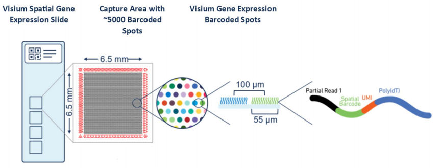
Figure 1.1 Principle of Visium Spatial Gene Expression Technology (In a 6.5 mm X 6.5 mm area, there are nearly 5,000 spots, each containing millions of spatial barcode capture probes. The DNA probes are 5' fixed on the slide, including Illumina sequencing primer sequences, spatial barcode, UMI, and poly(dT). The spatial barcode sequence of each spot is unique, with a diameter of 55 micrometers, capable of capturing RNA from 1 to 10 cells.)
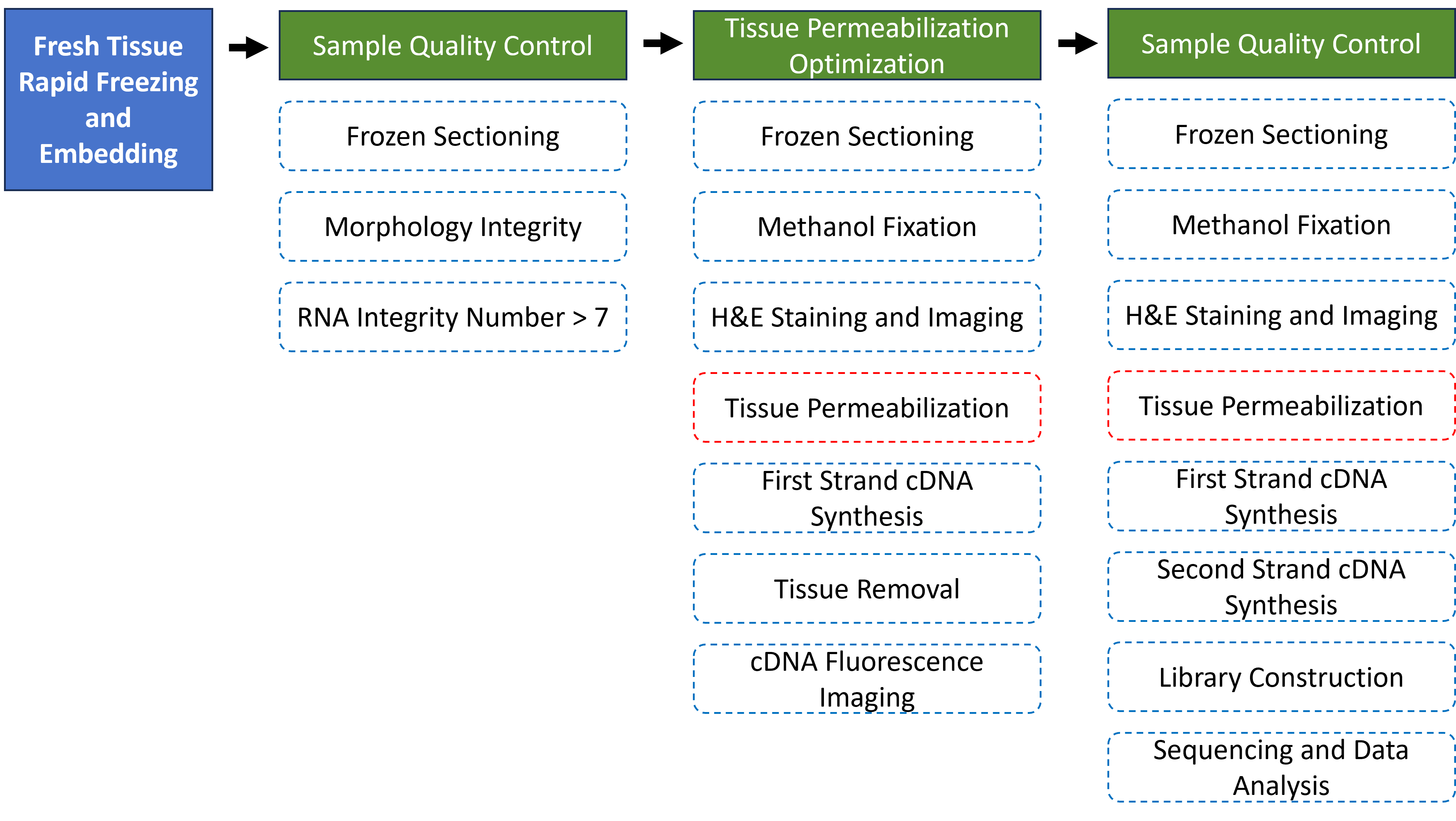
Every step of the 10X Visium spatial transcriptomics experimental workflow, from fresh tissue processing, sample preparation, sample quality control, tissue optimization, library construction, to sequencing, directly affects the quantity and quality of the sequencing data, and thus influences the results of subsequent information analysis. To ensure the accuracy and reliability of the sequencing data from the source, we promise to strictly control all data production processes, ensuring the generation of high-quality data from the very beginning. The overall experimental workflow of the 10x Genomics Visium™ spatial transcriptomics is shown as follows:
1.1 Sample Shipment Requirements
Different sample types require different cryopreservation methods. Customers should perform cryopreservation and embedding based on the characteristics of their samples, and can refer to the 10x official sample preparation recommendations for details. Customers are required to provide H&E histological information and RNA integrity test results of the frozen samples.
If customers are unable to provide H&E histological information and RNA integrity test results of the frozen samples, and the quality check fails after the samples are received by the company, the customer will need to bear certain costs. This will also result in a loss of time. Therefore, we recommend that customers perform quality checks on their samples if conditions permit.
1.2 Sample Quality Control
For mailed OCT-embedded tissue blocks, during sectioning, frozen sections are stained with H&E, photographed, and multiple frozen sections are collected for RNA extraction. The following two prerequisites must be met before proceeding with subsequent experimental operations: the histological information of the sample tissue must be intact, and the RNA must be non-degraded (RIN >= 7).
1.3 Tissue Permeabilization
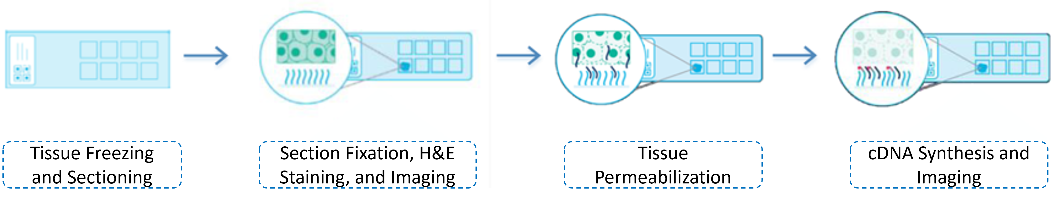
The purpose of tissue permeabilization is to determine the optimal permeabilization time for the sample type of interest, ensuring the release of RNA from the tissue samples for hybridization with the oligonucleotide probes on the slide to perform subsequent reverse transcription to synthesize cDNA. Since different types of samples have varying permeabilization conditions, it is recommended to use the 10X official tissue optimization kit (Visium Spatial Tissue Optimization Kit) to test the permeabilization time of the samples before conducting the formal experiment to determine the optimal permeabilization time. The tissue optimization experimental workflow is shown as follows:
1.4 Library Construction
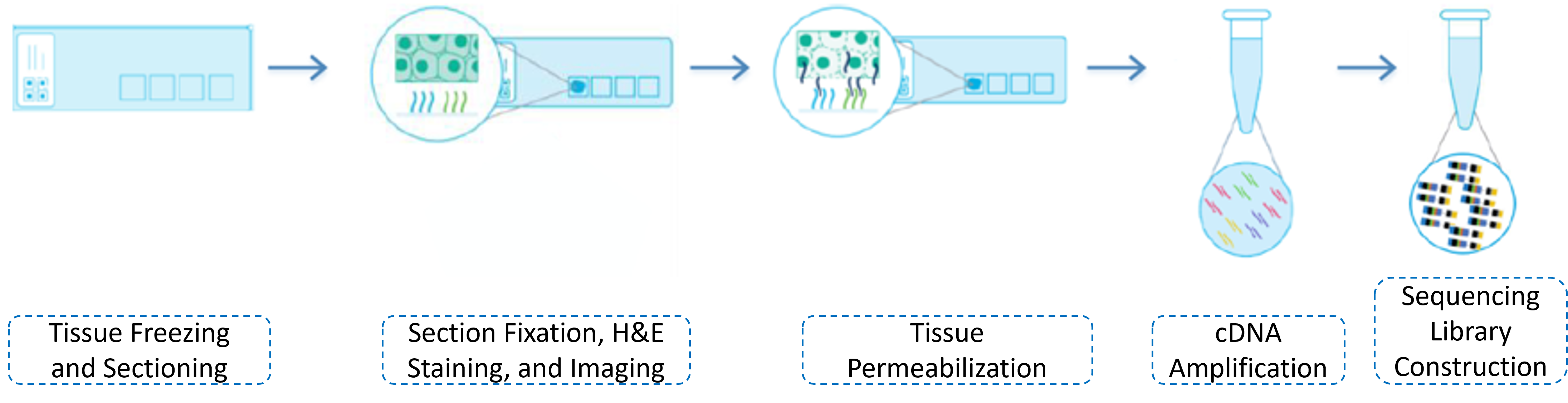
The library construction process includes the preparation of frozen sections, H&E staining and imaging, permeabilization treatment, cDNA synthesis, collection of cDNA into tubes for PCR amplification, and a series of experimental procedures for library construction. After the library passes the quality check, it is ready for sequencing. The library construction experimental workflow is shown as follows:
1.5 Sequencing
The 10X spatial transcriptomics library adopts the Illumina Hiseq PE150 or NovaSeq PE150 sequencing strategy. It is recommended to sequence 50,000-100,000 reads per spot, which means sequencing 75-100G of data per sample (5000 spots). The sequencing depth is related to the coverage area of the sample capture region on the slide, as well as the sample type and complexity. Increasing the sequencing data volume appropriately can improve the detection rate of genes.
The information of the Visium chip used for library construction is as follows:
| Sample Name | Chip Number (slide) | Capture Area (area) |
|---|---|---|
| posterior1 | V19L29-035 | A1 |
| posterior2 | V19L29-035 | C1 |
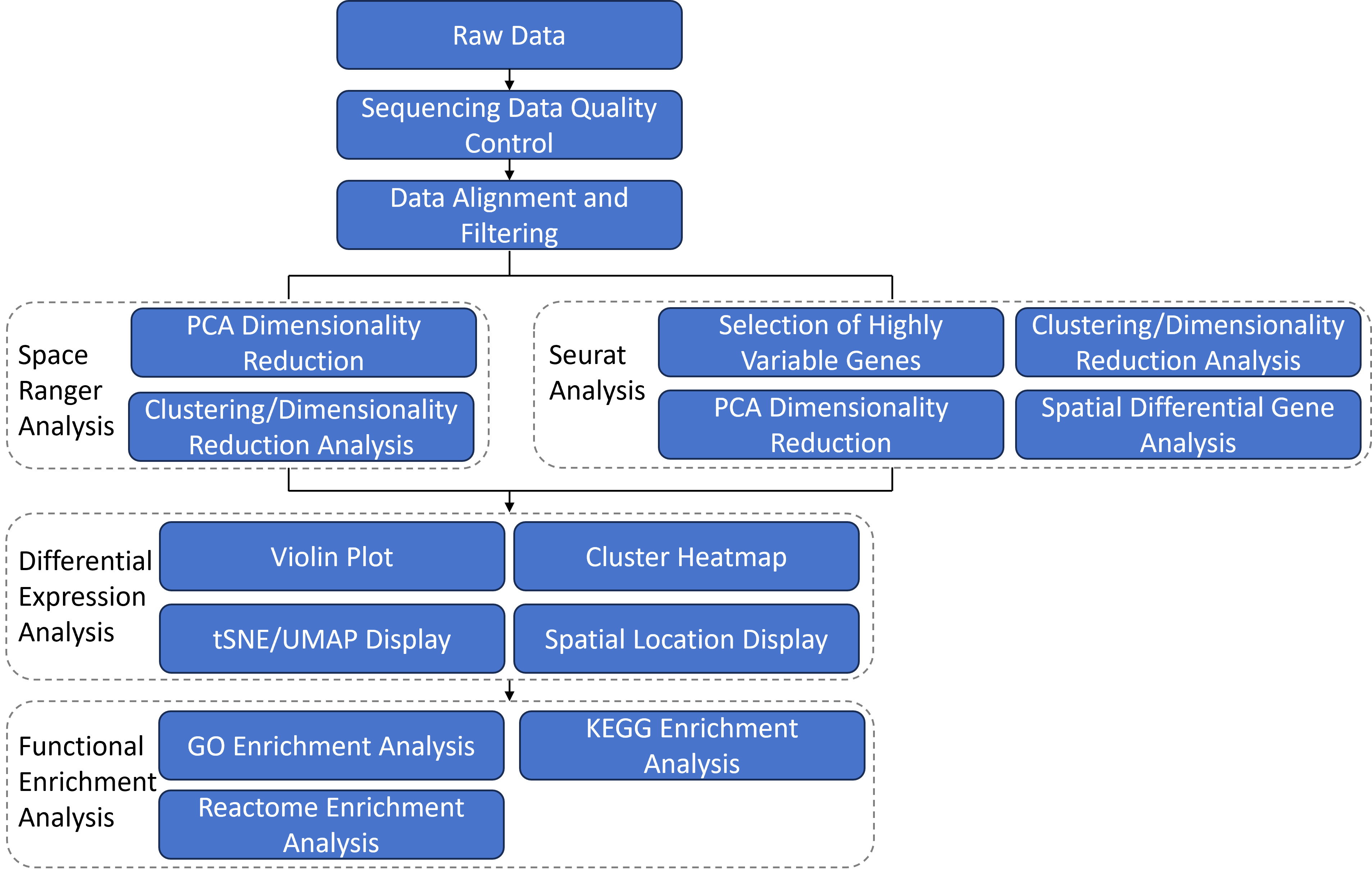
2 Bioinformatics Analysis Workflow
After obtaining the raw sequencing reads, the bioinformatics analysis is conducted through the following workflow. The 10X official software Space Ranger is used to integrate gene expression information with the spatial location information of tissue sections, intuitively displaying the spatial distribution of cell clusters and subclusters, as well as the spatial distribution of differentially expressed genes on the tissue sections. Subsequently, functional enrichment analysis is performed on these differentially expressed genes to identify the functional characteristics of the subclusters. In addition to the analysis results from Space Ranger, we also provide basic analysis results using the third-party software Seurat. Furthermore, we can offer customized analysis content such as cell definition, variant detection, copy number analysis, and ligand-receptor analysis according to customer requirements. (*: Customized analysis content is not included in the basic analysis report. Customers who require customized analysis should make separate requests.)
3 Data Alignment and Expression Quantification
3.1 Data Alignment (Space Ranger)
Space Ranger is the official software package provided by 10x Genomics for Visium spatial transcriptomics data analysis. Space Ranger takes the raw sequencing data in fastq format and the H&E-stained tissue section images as input data, and performs reference genome alignment, tissue detection, metrics calculation, and barcode/UMI statistics, generating a spot-gene expression matrix.
3.1.1 Reference Genome Alignment
The alignment software used by Space Ranger is STAR. After aligning reads to the reference genome, annotations are made using a GTF file, and reads are categorized into exon, intron, and intergenic regions. The specific rules for categorization are as follows: reads with at least 50% alignment to exons are classified as exon reads; reads that align to non-exon regions but intersect with introns are classified as intron reads; all others are classified as intergenic.
The basic data analysis using Space Ranger mainly includes the following results: statistics on the number of spots covered by the tissue section, the number of detected genes, sequencing data output and quality statistics, and reference genome alignment status. The statistical results for each sample in this project are as follows:
| Sample Name | Data Statistics |
|---|---|
| posterior1 | web_summary.html |
| posterior2 | web_summary.html |
3.1.2 Image Processing
Space Ranger detects spots covered by the tissue section, and only barcodes corresponding to spots covered by the tissue section are used for downstream analysis. Space Ranger relies on image processing algorithms to address two key issues related to the tissue section image: determining the placement of the tissue and aligning the fiducial pattern. Tissue detection is used to identify which capture points, and thus which barcodes, will be used for analysis. Fiducial alignment allows Space Ranger to know the location of each barcode-spot in the image, as the setup for imaging the Visium capture area may vary slightly for each user.
Space Ranger first extracts features that appear to be fiducials from the tissue section image, and then attempts to match these potential fiducials to the known fiducial pattern. The fiducials extracted from the image may have missing information, such as areas covered by the tissue, and may also have false positives, such as tissue debris or residue being identified as fiducials. The output of fiducial alignment is a coordinate transformation that associates the Visium barcode spot pattern with the user's tissue image.
Each area on the Visium slide contains 4,992 capture points. In practice, only a portion of these points are covered by the tissue. To restrict Space Ranger's analysis to only those points where the tissue is placed, Space Ranger uses an algorithm to identify the tissue in the bright-field image. Using the grayscale values of the input image, multiple samplings can be performed to calculate and compare multiple estimates of where the tissue section is placed. These estimates are used to train a statistical classifier to label each pixel within the capture area as either tissue or background.
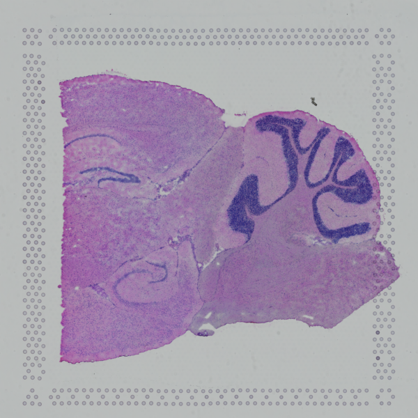
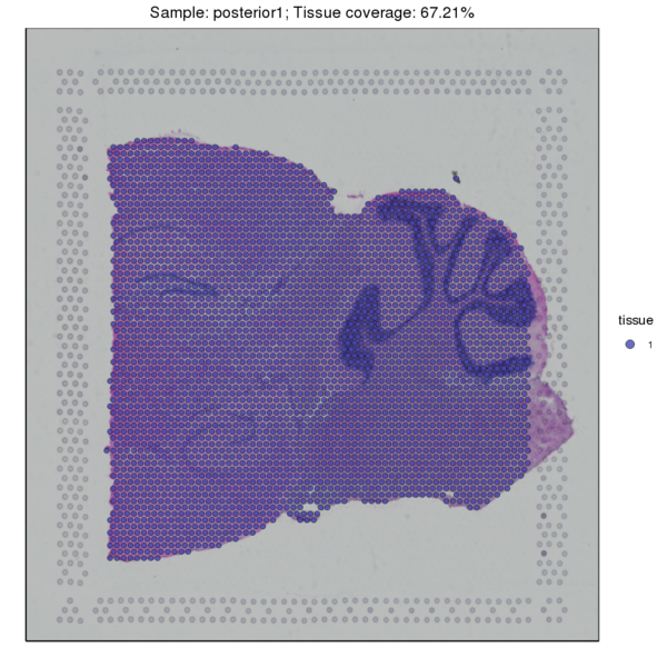
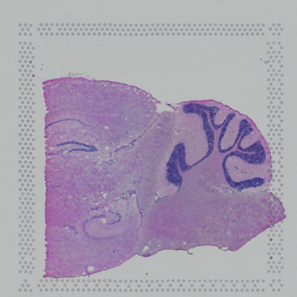
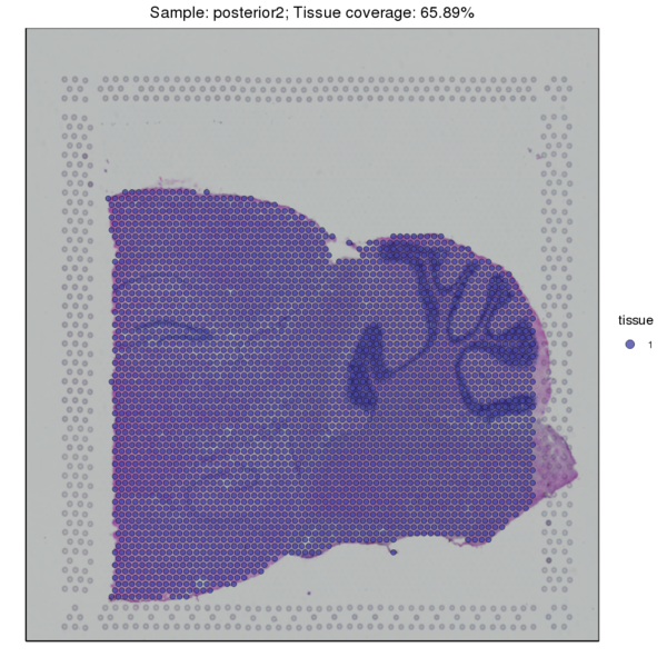
Figure 3.1 Image Alignment and Tissue Sample Detection
HE_Staining: H&E-stained tissue section image, tissue_Spatial: Spatial distribution map of tissue detection
3.2 Expression Quantification
We used the SpaceRanger software to count the UMI of each gene in every spot to obtain the spot-gene expression matrix of the sample. Basic quality control was performed on the data. The figure below shows the distribution of UMI/Gene counts across the tissue space.
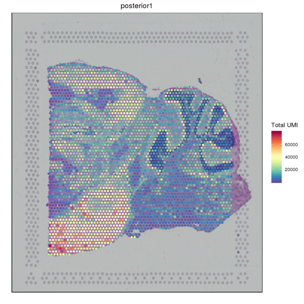
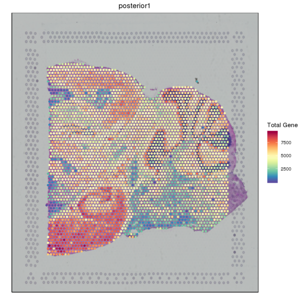
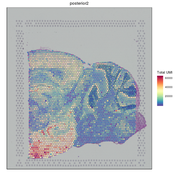
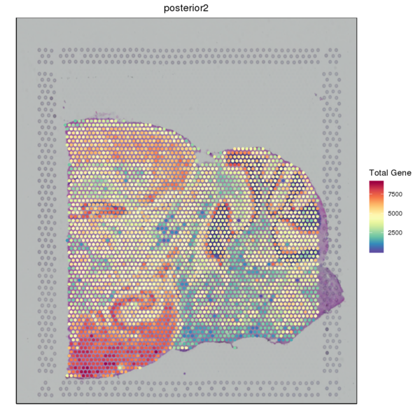
Figure 3.2 Gene Expression Quantification of Spatial Spots
UMI_Spatial: Spatial distribution map of UMI counts, Gene_Spatial: Spatial distribution map of detected gene counts
4 Space Ranger Analysis
The Space Ranger software can directly perform downstream analysis on the gene expression matrix, which mainly includes PCA dimensionality reduction, clustering analysis, t-SNE dimensionality reduction, and UMAP dimensionality reduction. We conduct secondary analysis and visualization based on these results. Principal Component Analysis (PCA) is a method that applies variance decomposition to reduce the dimensions of multidimensional data and extract the most significant structures within the data. t-SNE (t-Stochastic Neighbor Embedding) and UMAP (Uniform Manifold Approximation and Projection) are currently very popular nonlinear, unsupervised dimensionality reduction methods in the field of machine learning, capable of preserving the original data's characteristics to the greatest extent while significantly reducing the number of features. Space Ranger first performs PCA using the IRLBA algorithm, reducing the dataset's dimensions from (spot x genes) to (spot x M, where M is the number of principal components). It then applies the nonlinear dimensionality reduction algorithms t-SNE and UMAP to display the reduced data in a two-dimensional space. The more similar the gene expression patterns between cells, the closer their distances in the two-dimensional space of t-SNE or UMAP. For clustering analysis, Space Ranger uses the following two methods.
4.1 Graphclust Clustering Analysis
The graph-based clustering algorithm consists of two steps: First, a k-nearest neighbor sparse matrix is constructed between spots using the PCA-reduced data, grouping a spot with its k nearest spots based on Euclidean distance. Then, the Louvain algorithm is applied to optimize modularity, aiming to identify highly connected modules within the graph. Finally, hierarchical clustering is used to merge clusters within the same region that do not have differentially expressed genes (with a BH-corrected p-value below 0.05). This process is repeated until no more clusters can be merged.
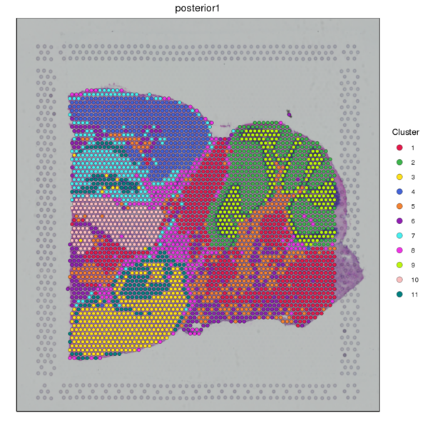
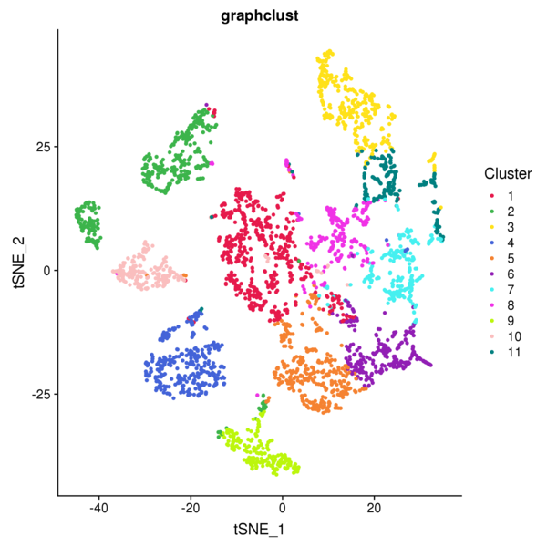
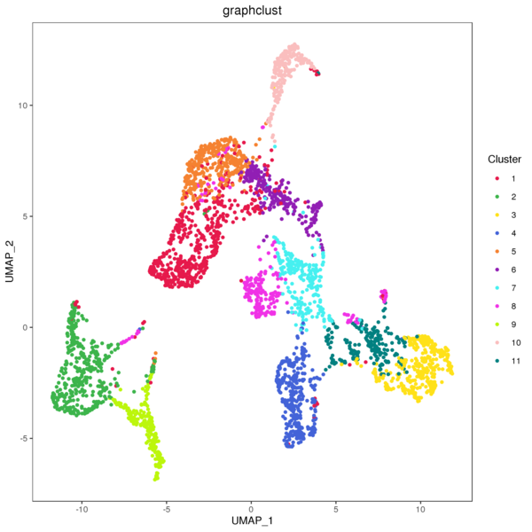
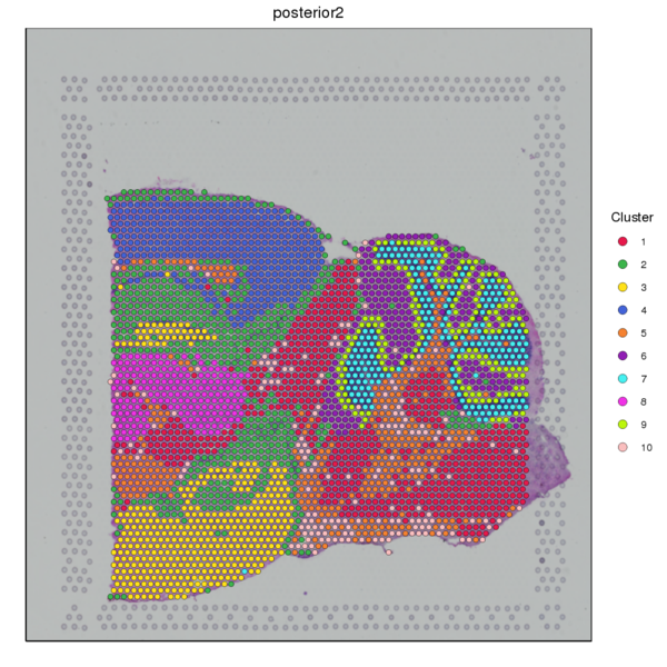
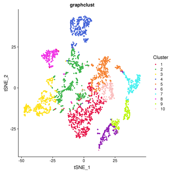
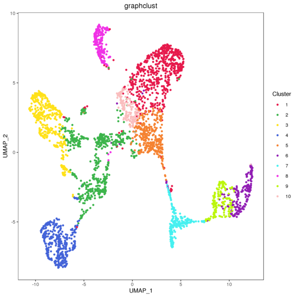
Figure 4.1 Graph-based Classification Results
graphclust_Spatial: Spatial distribution map of clusters, graphclust_tSNE: t-SNE two-dimensional display of clusters, graphclust_UMAP: UMAP two-dimensional display of clusters
4.2 K-means Clustering Analysis
The K-Means algorithm randomly selects k cluster centroids in the PCA-reduced space. For each spot, it calculates which cluster it should belong to. Then, for each cluster, it recalculates the centroid of that cluster. This process is repeated until convergence. Note that the k here is the pre-specified number of subclusters (which is different from the k in the graph-based clustering algorithm), and the centroid represents the estimated center point of spots belonging to the same cluster. We have provided clustering results for nine different k values (k ranging from 2 to 10). The detailed results are as follows.
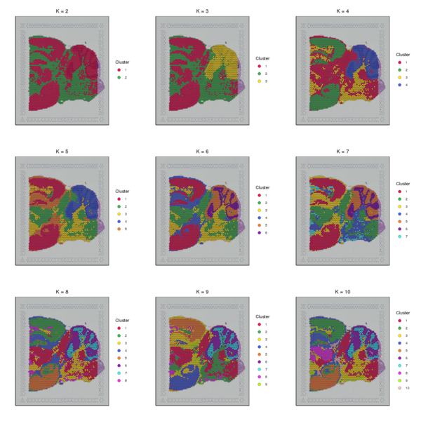
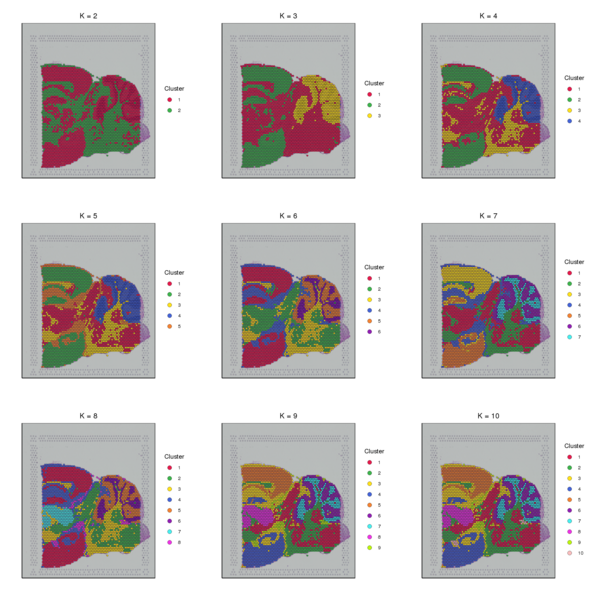
Figure 4.2 Spatial Distribution of K-Means Clustering (k=2 to k=10)
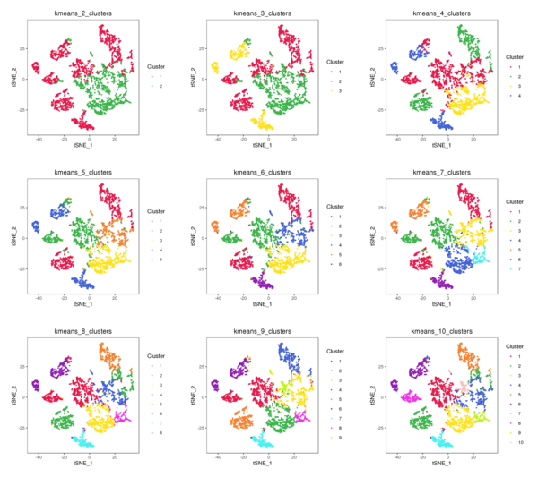
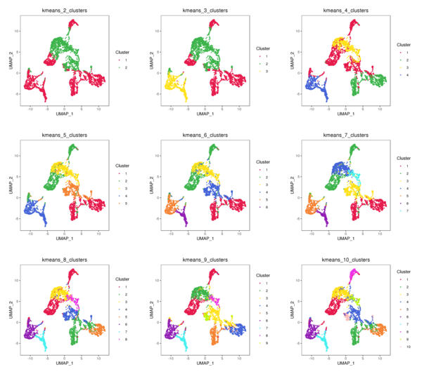
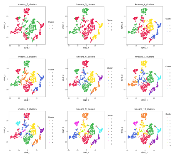
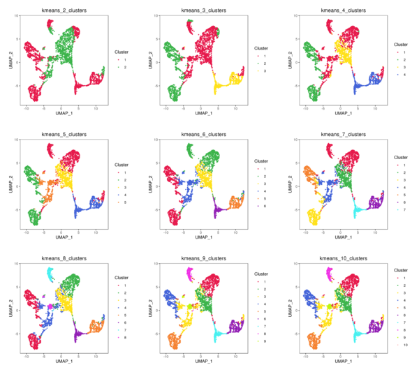
Figure 4.3 t-SNE and UMAP Distribution of K-Means Clustering (k=2 to k=10)
kmeans_tSNE: t-SNE two-dimensional display of clusters, kmeans_UMAP: UMAP two-dimensional display of clusters
5 Seurat Analysis
Seurat is a widely used third-party tool for analyzing 10x spatial transcriptomics or single-cell transcriptomics data. Based on the Seurat software package, we have conducted secondary development to perform the following analysis steps on the gene expression matrix at the spot level: (1) Quality control of the data and removal of low-quality spots that may interfere with downstream analysis; (2) Normalization of the data to eliminate capture size bias; (3) Feature selection to identify genes with large expression differences for downstream analysis; (4) Dimensionality reduction using principal component analysis; (5) Clustering analysis of spots using a graph-based algorithm; (6) Dimensionality reduction display of clustering results using t-SNE and UMAP algorithms; (7) Identification of spatially differentially distributed genes.
5.1 Data Filtering
After obtaining the gene expression matrix generated by SpaceRanger, we will filter the spots again based on indicators such as the number of detected genes and the proportion of mitochondrial UMI, removing outliers to ensure the reliability and accuracy of the subsequent analysis results.
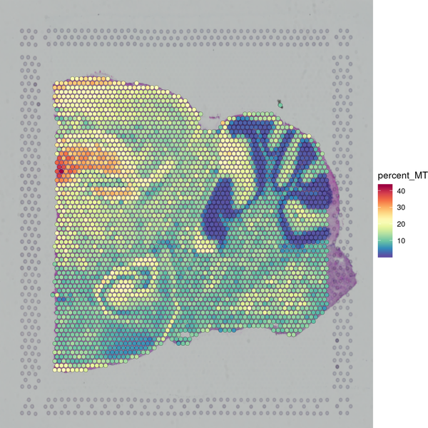
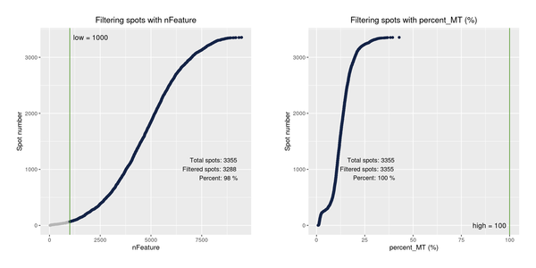
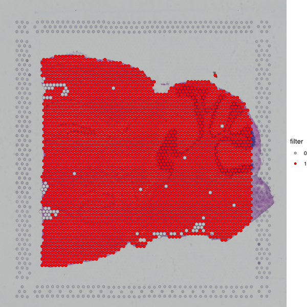
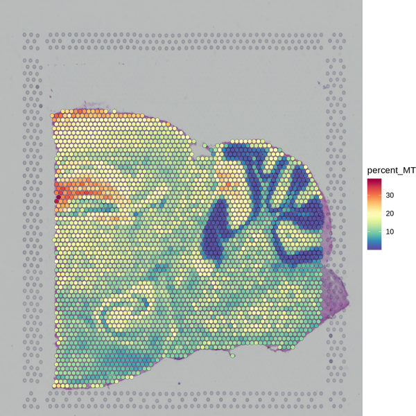
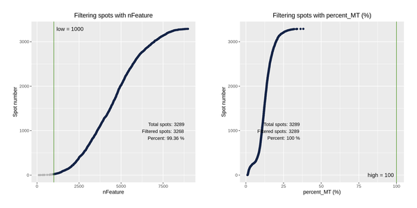
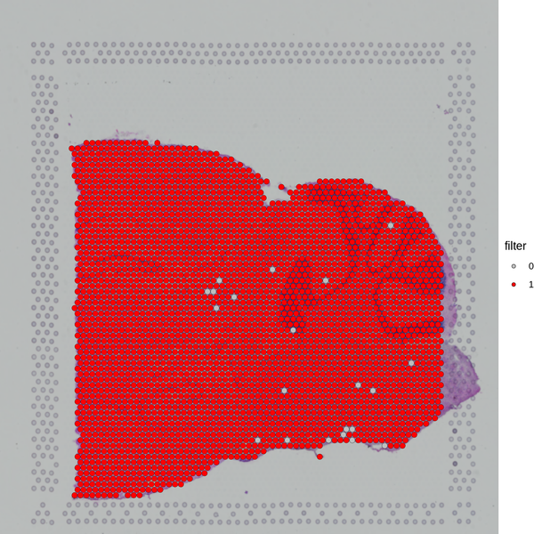
Figure 5.1 Filtering Spots Based on Gene Detection and Mitochondrial Gene Proportion
MT_Spatial: Spatial distribution map of mitochondrial gene proportion, Filter_Stat: Distribution of spots filtered under different conditions, Filter_Spatial: Spatial distribution map of spot filtering
Distribution of spots filtered under different conditions: The x-axis of each figure represents the statistics of different filtering indicators, and the y-axis represents the number of spots. The blue line indicates the filtering threshold, and the gray area represents the spots that have been filtered out.
5.2 Identification of Highly Variable Genes
Seurat uses the sctransform (SCT) algorithm for data normalization, and then employs the vst algorithm to select the set of genes with the greatest expression variability across the entire dataset, identified as highly variable genes (HVGs). The red points in the figure below represent the highly variable genes, totaling 3,000. The selected highly variable genes are used for principal component analysis and downstream analyses.
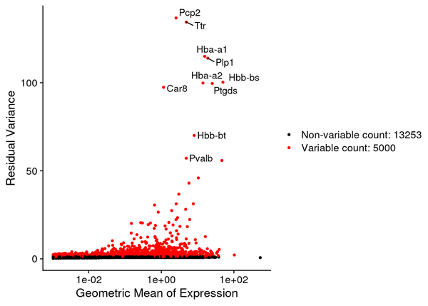
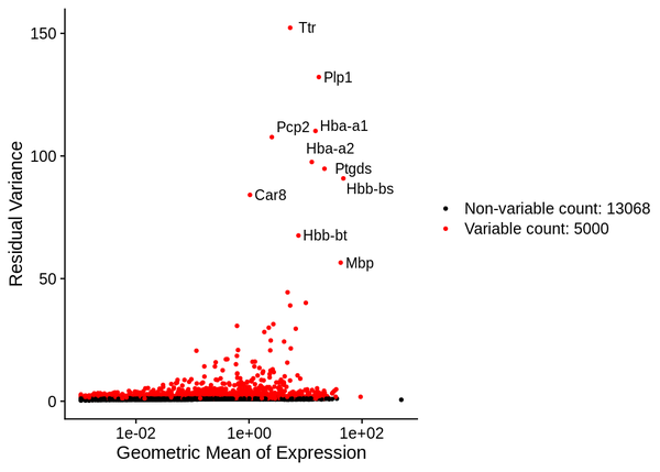
Figure 5.2 Volcano Plot of Highly Variable Genes
The x-axis represents the geometric mean of gene expression levels, and the y-axis represents the variance/variability statistics, with the top 10 highly variable genes marked.
5.3 PCA Analysis
During PCA analysis, Seurat can calculate the standard deviation and P-value of principal components. We can select an appropriate number of principal components based on the standard deviation and P-value of the principal components.
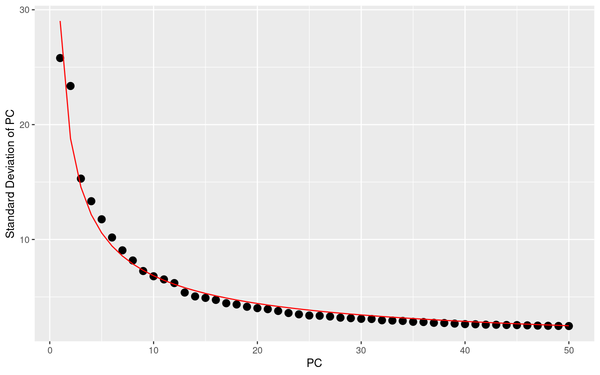
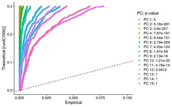
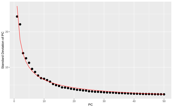
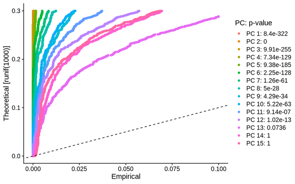
Figure 5.3 PCA Analysis Display
PCA_sdev: Display of standard deviation statistics for each principal component, with the x-axis representing the principal components and the y-axis representing the standard deviation.
PCA_JackStraw: JackStraw assessment of principal components for reference in selecting principal components, typically choosing principal components with a p-value < 0.05 for subsequent analysis.
5.4 Clustering and Dimensionality Reduction Analysis
Seurat employs a Graph-based method for clustering analysis, similar to the algorithm used in Space Ranger. The clustering results are displayed through tissue sections and t-SNE and UMAP dimensionality reduction.
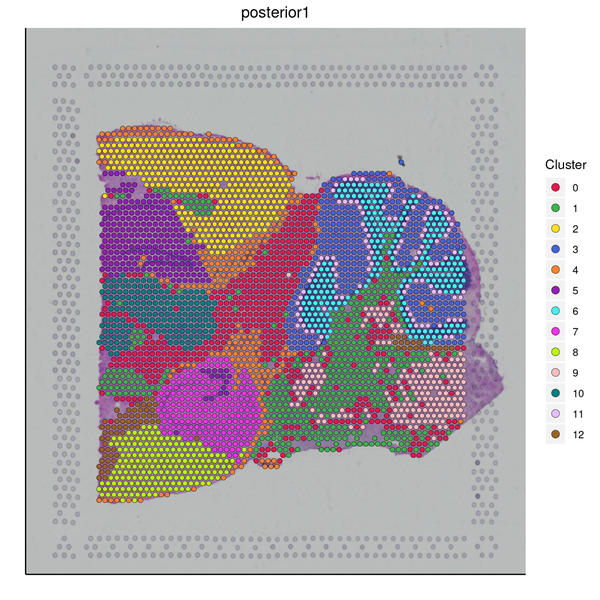
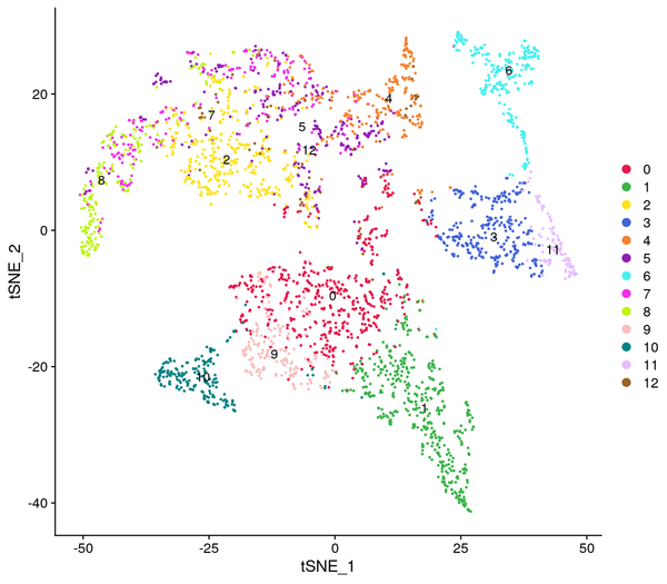
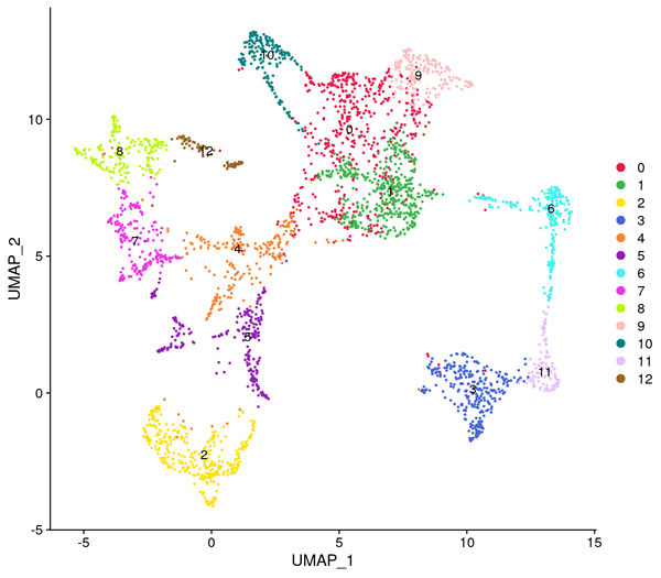
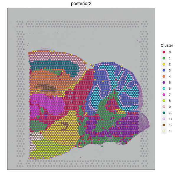
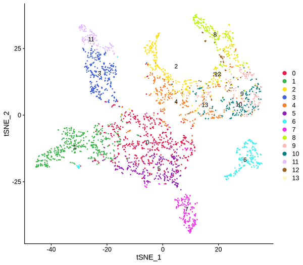
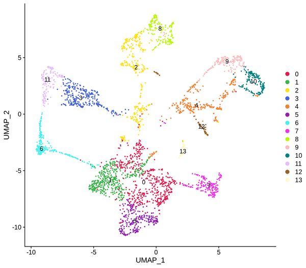
Figure 5.4 Clustering Analysis Display: Spatial Distribution of Clusters, t-SNE Distribution, UMAP Distribution
cluster_Spatial: Spatial distribution map of clusters, cluster_tSNE: t-SNE two-dimensional display of clusters, cluster_UMAP: UMAP two-dimensional display of clusters
5.5 Spatially Specific Gene Expression Analysis
The Seurat software provides a method for identifying spatially specific gene expression that does not rely on clustering results. This method (markvariogram) can measure the dependence of gene expression on its spatial location, and by setting certain thresholds, spatially specific gene expression can be detected. We have displayed the top 6 genes with spatially differential distribution.
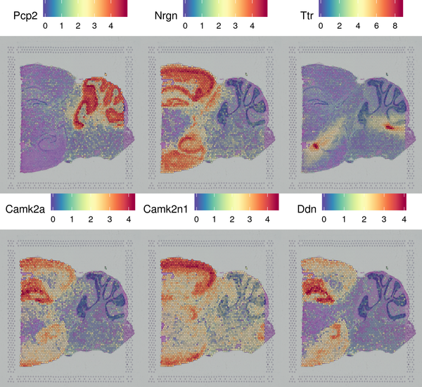
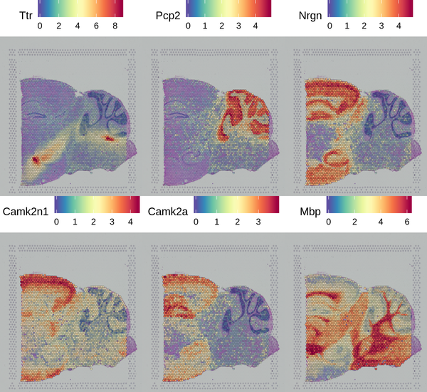
Figure 5.5 Display of Spatially Specific Gene Expression
6 Differential Expression Analysis
We provide clustering results from multiple clustering algorithms, allowing customers to select appropriate results based on their research objectives and biological significance for subsequent analysis and scientific research. For different clustering results, we use different differential analysis methods: For clustering results from Space Ranger, we use edgeR for differential analysis; for clustering results from Seurat, we use the Wilcoxon rank-sum test (wilcox method). Both methods utilize the default algorithms provided by their respective software packages. By comparing one subcluster of a sample with all other subclusters of the same sample, we obtain a list of differentially expressed genes between that subcluster and the others. Based on these differentially expressed genes, we identify genes with higher expression in that subcluster compared to others as candidate marker genes, i.e., those with a logFC greater than 0. Differential expression results for each cluster are presented in various formats, with the Seurat clustering results of the first sample listed in the information collection form used as an example in the final report.
6.1 Differential Analysis Results
| gene_id | gene | cluster | avg_logFC | p_val | p_val_adj | pct.1 | pct.2 |
|---|---|---|---|---|---|---|---|
| ENSMUSG00000031425 | Plp1 | 1 | 2.04208632615082 | 3.05033594931447e-234 | 5.51134699322139e-230 | 1 | 0.902 |
| ENSMUSG00000041607 | Mbp | 1 | 1.67576480159476 | 8.82858058593994e-231 | 1.59514794026763e-226 | 1 | 0.998 |
| ENSMUSG00000032554 | Trf | 1 | 1.68398011189939 | 7.47977290894177e-228 | 1.3514453691876e-223 | 1 | 0.819 |
| ENSMUSG00000032517 | Mobp | 1 | 1.64413483836605 | 5.14147588494275e-226 | 9.28961862891456e-222 | 1 | 0.794 |
(1) gene_id: Gene ID
(2) gene: Gene name
(3) cluster: Cluster
(4) avg_logFC: Average log2 fold change in gene expression
(5) p_val: Differential analysis p-value
(6) p_val_adj: Adjusted p-value
(7) pct.1: Proportion of spots expressing the gene in the cluster
(8) pct.2: Proportion of spots expressing the gene in other clusters
6.2 Differential Gene Clustering Heatmap Display
A heatmap is generated to display the top differentially expressed genes identified in each cluster. The expression levels of these genes are higher within the same cluster compared to other groups. The log10(UMI+1) values are normalized and clustered, with yellow indicating high expression and purple indicating low expression in the heatmap. The clustering heatmap is shown in the figure below:
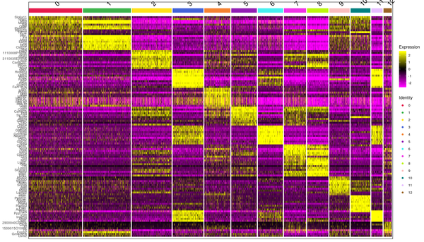
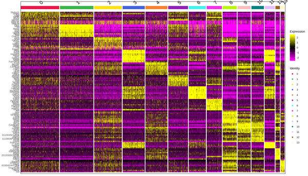
Figure 6.1 Heatmap Display of Differentially Expressed Genes
6.3 Spatial Distribution Display of Differentially Expressed Genes
We have presented the top 4 differentially expressed genes for each cluster in various formats. The final report only displays the results for one cluster. The figure below shows the spatial distribution of differentially expressed genes.
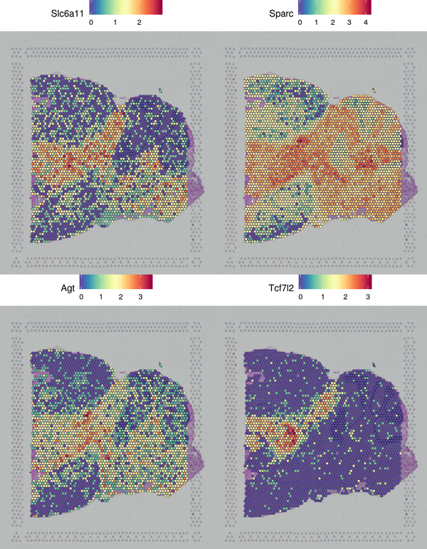
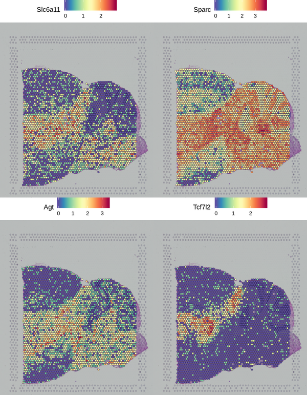
Figure 6.2 Spatial Distribution Display of Differentially Expressed Genes
6.4 Violin Plot Display of Differentially Expressed Genes
We have presented the top 4 differentially expressed genes for each cluster in various formats. The final report only displays the results for one cluster. The figure below shows the Violin plot display of differentially expressed gene expression.
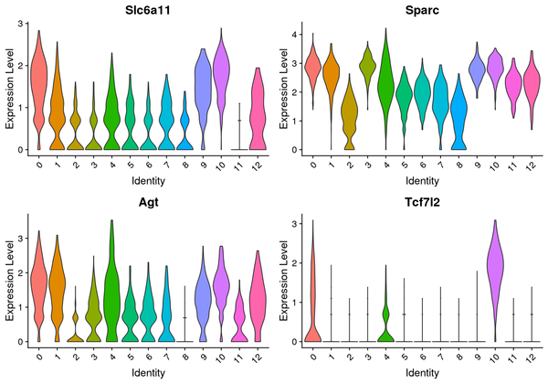
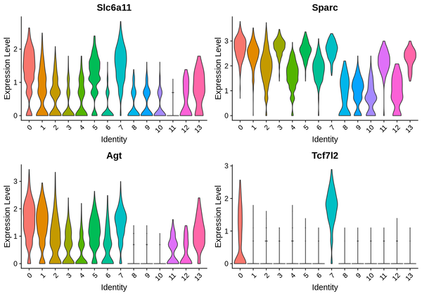
Figure 6.3 Violin Plot of Differentially Expressed Genes
The figure displays 4 marker genes, with the x-axis representing cluster numbers and the y-axis representing the average expression levels of the genes.
6.5 t-SNE/UMAP Dimensionality Reduction Display of Differentially Expressed Genes
We have presented the top 4 differentially expressed genes for each cluster in various formats. The final report only displays the results for one cluster. The figure below shows the t-SNE and UMAP dimensionality reduction display of differentially expressed genes.
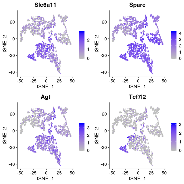
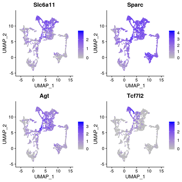
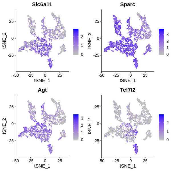
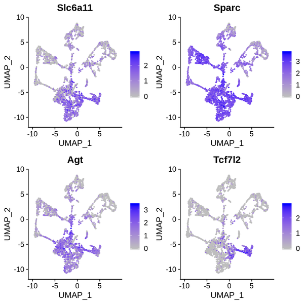
Figure 6.4 t-SNE and UMAP Dimensionality Reduction Display of Differentially Expressed Genes
gene_tSNE: t-SNE two-dimensional display of gene expression, gene_UMAP: UMAP two-dimensional display of gene expression
7 Functional Enrichment Analysis
By performing enrichment analysis on the differentially highly expressed genes in each cluster from different clustering methods, we can identify which biological functions or pathways are significantly associated with the differentially highly expressed genes in each cluster. We use the clusterProfiler software to conduct GO functional enrichment analysis and KEGG pathway enrichment analysis on the differentially highly expressed gene sets of each cluster. This method is based on the principle of the hypergeometric distribution for gene set enrichment analysis (Gene Set Enrichment, GSE). The tables displayed in the final report are the enrichment analysis results of the differentially highly expressed gene set of cluster 1 obtained from the Seurat clustering results of the first sample listed in the information collection form.
7.1 GO Functional Enrichment
GO (Gene Ontology) is a comprehensive database for describing gene functions, which can be divided into three parts: molecular function, biological process, and cellular component. GO enrichment analysis considers a corrected p-value less than 0.05 as significant enrichment, and the results are shown as follows:
| Category | ID | Description | GeneRatio | BgRatio | pvalue | padj |
|---|---|---|---|---|---|---|
| GO | GO:0043209 | myelin sheath | 11/36 | 189/22260 | 6.15762409458533e-15 | 3.60836771942701e-12 |
| GO | GO:0019911 | structural constituent of myelin sheath | 5/36 | 10/22260 | 2.07472779682085e-12 | 6.07895244468508e-10 |
| GO | GO:0042552 | myelination | 6/36 | 56/22260 | 3.53478661298525e-10 | 6.90461651736452e-08 |
| GO | GO:0043218 | compact myelin | 3/36 | 5/22260 | 3.87584246183853e-08 | 5.67810920659345e-06 |
(1) Category: Database name
(2) ID: GO ID
(3) Description: GO description
(4) GeneRatio: Differential gene ratio (number of differentially expressed genes in the GO term / total number of differentially expressed genes)
(5) BgRatio: Background gene ratio (number of background genes in the GO term / total number of background genes)
(6) pvalue: p-value for enrichment analysis
(7) p.adjust: Adjusted p-value
The results of the GO enrichment analysis are displayed in various formats, including a heatmap of enrichment at the cluster level, bar charts of enriched GO terms, scatter plots of enriched GO terms, and network connection diagrams of enriched GO terms.
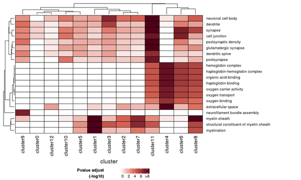
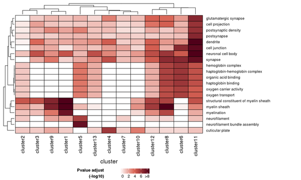
Figure 7.1 Heatmap of GO Enrichment Analysis
Each row represents a GO function, and each column represents a cluster number. The intensity of the color indicates the p-value (adjusted) of the enrichment analysis.
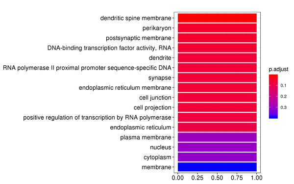
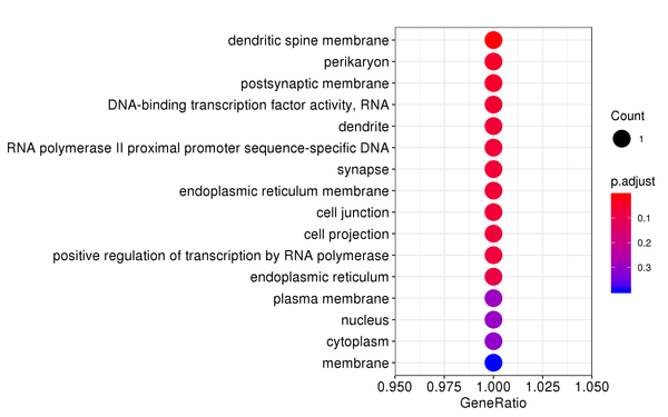
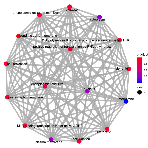
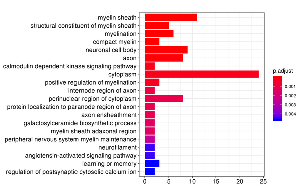
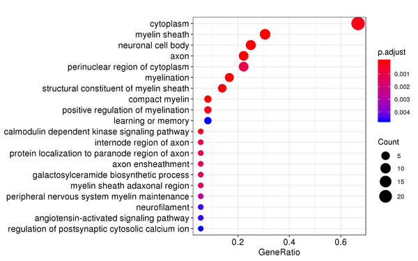
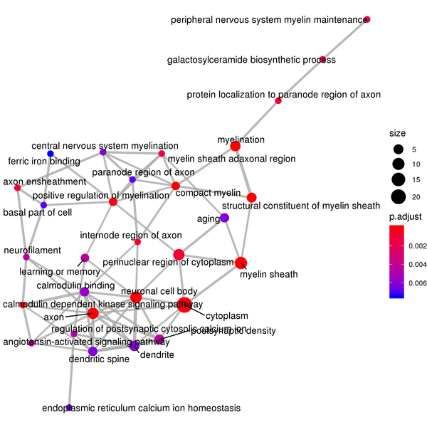
Figure 7.2 GO Enrichment Analysis Barplot, Dotplot, and Network Connection Map (emapplot)
Barplot: The x-axis represents the number of differentially expressed genes, and the y-axis represents GO functions. The intensity of the color indicates the p-value (adjusted) of the enrichment.
Dotplot: The x-axis represents the proportion of differentially expressed genes, and the y-axis represents GO functions. The size of the dot indicates the number of differentially expressed genes, and the intensity of the color indicates the p-value (adjusted) of the enrichment.
Network Connection Map: Nodes represent GO functions, and the thickness of the lines indicates the number of shared differentially expressed genes between pairs of GO terms. The size of the node indicates the number of differentially expressed genes, and the intensity of the color indicates the p-value (adjusted) of the enrichment.
7.2 KEGG Pathway Enrichment
KEGG (Kyoto Encyclopedia of Genes and Genomes) is a comprehensive database that integrates genomic, chemical, and systems functional information. KEGG enrichment analysis considers a corrected p-value less than 0.05 as significant enrichment, and the results are shown as follows:
| Category | ID | Description | GeneRatio | BgRatio | pvalue | padj |
|---|---|---|---|---|---|---|
| KEGG | mmu04971 | Gastric acid secretion | 3/16 | 76/8788 | 0.000321030811576264 | 0.0266455573608299 |
| KEGG | mmu04972 | Pancreatic secretion | 3/16 | 109/8788 | 0.000924139482649758 | 0.0383517885299649 |
| KEGG | mmu04216 | Ferroptosis | 2/16 | 41/8788 | 0.00244516858191423 | 0.067649664099627 |
| KEGG | mmu04978 | Mineral absorption | 2/16 | 54/8788 | 0.00420869180250637 | 0.0873303549020072 |
(1) Category: Database name
(2) ID: KEGG ID
(3) Description: KEGG description
(4) GeneRatio: Differential gene ratio (number of differentially expressed genes in the KEGG pathway / total number of differentially expressed genes)
(5) BgRatio: Background gene ratio (number of background genes in the KEGG pathway / total number of background genes)
(6) pvalue: p-value for enrichment analysis
(7) p.adjust: Adjusted p-value
The results of the KEGG pathway enrichment analysis are displayed in various formats, including a heatmap of enrichment at the cluster level, bar charts of enriched KEGG pathways, scatter plots of enriched KEGG pathways, and network connection diagrams of enriched KEGG pathways.
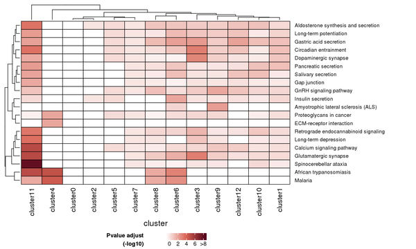
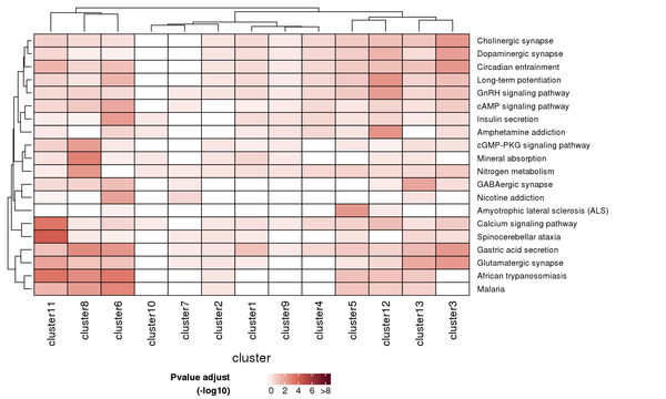
Figure 7.3 Heatmap of KEGG Enrichment Analysis
Each row represents a KEGG pathway, and each column represents a cluster number. The intensity of the color indicates the p-value (adjusted) of the enrichment analysis.
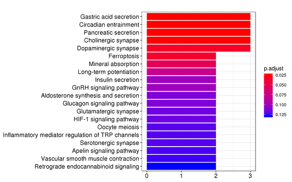
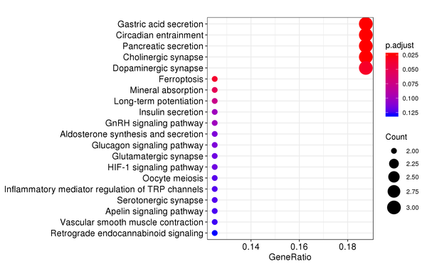
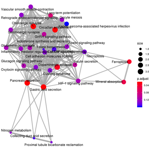
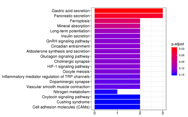
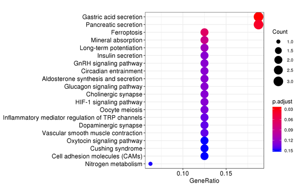
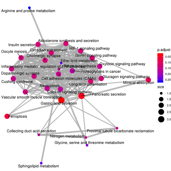
Figure 7.4 KEGG Enrichment Analysis Barplot, Dotplot, and Network Connection Map (emapplot)
Barplot: The x-axis represents the number of differentially expressed genes, and the y-axis represents KEGG pathways. The intensity of the color indicates the p-value (adjusted) of the enrichment.
Dotplot: The x-axis represents the proportion of differentially expressed genes, and the y-axis represents KEGG pathways. The size of the dot indicates the number of differentially expressed genes, and the intensity of the color indicates the p-value (adjusted) of the enrichment.
Network Connection Map: Nodes represent KEGG pathways, and the thickness of the lines indicates the number of shared differentially expressed genes between pairs of KEGG pathways. The size of the node indicates the number of differentially expressed genes, and the intensity of the color indicates the p-value (adjusted) of the enrichment.
7.3 Reactome Pathway Enrichment
The Reactome database compiles human reactions and biological pathways. Reactome enrichment analysis considers a padj value less than 0.05 as significant enrichment, and the results are shown as follows:
| Category | ID | Description | GeneRatio | BgRatio | pvalue | padj |
|---|---|---|---|---|---|---|
| REACTOME | R-MMU-3371571 | Mus musculus: HSF1-dependent transactivation | 2/18 | 22/8669 | 0.000917816629867246 | 0.109220178954202 |
| REACTOME | R-MMU-442755 | Mus musculus: Activation of NMDA receptors and postsynaptic events | 2/18 | 35/8669 | 0.00232659397936183 | 0.138432341772029 |
| REACTOME | R-MMU-5578775 | Mus musculus: Ion homeostasis | 2/18 | 50/8669 | 0.00470261670265493 | 0.146233284883189 |
| REACTOME | R-MMU-917937 | Mus musculus: Iron uptake and transport | 2/18 | 56/8669 | 0.00586849262595769 | 0.146233284883189 |
(1) Category: Database name
(2) ID: Reactome pathway ID
(3) Description: Description of the Reactome pathway
(4) GeneRatio: Differential gene ratio (number of differentially expressed genes in the Reactome pathway / total number of differentially expressed genes)
(5) BgRatio: Background gene ratio (number of background genes in the Reactome pathway / total number of background genes)
(6) pvalue: p-value for enrichment analysis
(7) p.adjust: Adjusted p-value
The results of the Reactome pathway enrichment analysis are displayed in various formats, including a heatmap of enrichment at the cluster level, bar charts of enriched Reactome pathways, scatter plots of enriched Reactome pathways, and network connection diagrams of enriched Reactome pathways.
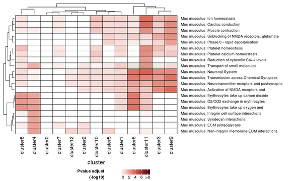
Figure 7.5 Heatmap of Reactome Pathway Enrichment Analysis
Each row represents a Reactome pathway, and each column represents a cluster number. The intensity of the color indicates the p-value (adjusted) of the enrichment analysis.
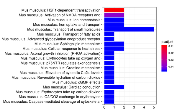
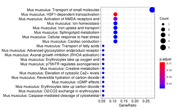
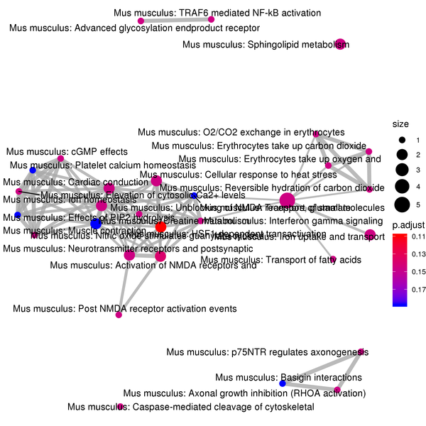
Figure 7.6 Reactome Enrichment Analysis Barplot, Dotplot, and Network Connection Map (emapplot)
Barplot: The x-axis represents the number of differentially expressed genes, and the y-axis represents Reactome pathways. The intensity of the color indicates the p-value (adjusted) of the enrichment.
Dotplot: The x-axis represents the proportion of differentially expressed genes, and the y-axis represents Reactome pathways. The size of the dot indicates the number of differentially expressed genes, and the intensity of the color indicates the p-value (adjusted) of the enrichment.
Network Connection Map: Nodes represent Reactome pathways, and the thickness of the lines indicates the number of shared differentially expressed genes between pairs of Reactome pathways. The size of the node indicates the number of differentially expressed genes, and the intensity of the color indicates the p-value (adjusted) of the enrichment.
Notes
List of Analysis Software and Versions
| Analysis Content | Software | Version |
|---|---|---|
| Quality Control | In-house | 1.0.0 |
| Alignment and Quantification | SpaceRanger | spaceranger-1.1.0 |
| Dimensionality Reduction and Clustering | SpaceRanger | spaceranger-1.1.0 |
| Dimensionality Reduction and Clustering | Seurat | 3.1.2 |
| Differential Analysis | edgeR | 3.24.3 |
| Enrichment Analysis | clusterProfiler | 3.10.1 |
Methods
To facilitate the writing of your manuscript, we have prepared an English version of the methods for your reference.
Loupe Browser Instructions
To assist you in viewing the cloupe files in the result files, we have provided the Chinese user manual for the Loupe Browser visualization software, which can be used for clustering, genotyping, differential gene screening, and heatmap drawing.
References
1. Westholm, J.O., Huss, M., et al. (2016). Visualization and analysis of gene expression in tissue sections by spatial transcriptomics. Science 353, 78-82. (Visium)
2. Dobin A, Davis C A, Schlesinger F, et al. STAR: ultrafast universal RNA-seq aligner[J]. Bioinformatics, 2013, 29(1): 15-21. (STAR)
3. Becht, E., McInnes, L., Healy, J. et al. Dimensionality reduction for visualizing single-cell data using UMAP. Nat Biotechnol 37, 38–44 (2019). (UMAP)
4. Van der Maaten, L., Accelerating t-SNE using Tree-Based Algorithms. Journal of Machine Learning Research 15, 3221-3245 (2014). (t-SNE)
5. Butler, A., Hoffman, P., Smibert, P., Papalexi, E., & Satija, R. (2018). Integrating single-cell transcriptomic data across different conditions, technologies, and species. Nature Biotechnology, 36(5), 411–420. (Seurat)
6. Stuart,T.et al.Comprehensive Integration of Single-Cell Data. Cell, 177, 1888–1902.e21 (2019). (Seurat)
7. Edsgärd, D., Johnsson, P., & Sandberg, R. (2018). Identification of spatial expression trends in single-cell gene expression data. Nature Methods, 15(5), 339–342. doi:10.1038/nmeth.4634. (Seurat)
8. Korsunsky I., Millard N., Fan J., Slowikowski K., Zhang F., Wei K., Baglaenko Y., Brenner M., Loh P.R., Raychaudhuri S. Fast, sensitive and accurate integration of single-cell data with Harmony. Nat. Methods. 2019;16:1289-1296. (Harmony)
9. Love, M. L., Huber, W. & Anders, S., Moderated estimation of fold change and dispersion for RNA-seq data with DESeq2. Genome Biology 15, number 550 (2014). (DESeq2)
10. Robinson M D, McCarthy D J, Smyth G K. edgeR: a Bioconductor package for differential expression analysis of digital gene expression data[J]. Bioinformatics, 2010, 26(1): 139-140. (edgeR)
11. Yu, D., Huber, W. & Vitek, O., Shrinkage estimation of dispersion in Negative Binomial models for RNA-seq experiments with small sample size. Bioinformatics 29, 1275–1282 (2013).
12. Robinson, M. D. & Smyth, G. K. Small-sample estimation of negative binomial dispersion, with applications to SAGE data. Biostatistics 9, 321–332 (2007).
13. Guangchuang Yu, Li-Gen Wang, Yanyan Han, Qing-Yu He. clusterProfiler: an R package for comparing biological themes among gene clusters. OMICS: A Journal of Integrative Biology. 2012, 16(5):284-287. (clusterProfiler)
14. Kanehisa M, Goto S. KEGG: kyoto encyclopedia of genes and genomes[J]. Nucleic acids research, 2000, 28(1): 27-30. (KEGG)
15. G Yu, QY He*. ReactomePA: an R/Bioconductor package for reactome pathway analysis and visualization. Molecular BioSystems 2016, 12(2):477-479. (Reactome)
16. Aran D, Looney AP, Liu L, Wu E, Fong V, Hsu A. et al. Reference-based analysis of lung single-cell sequencing reveals a transitional profibrotic macrophage. Nature Immunology. 2019;20:163–72. (SingleR)
17. https://rdrr.io/cran/clustermole/ (clustermole)
18. Zhang X, Lan Y, Xu J, Quan F, Zhao E, Deng C. et al. CellMarker: a manually curated resource of cell markers in human and mouse. Nucleic Acids Research. 2018;47:D721–D8. (CellMarker)
19. Franzén, O., Gan, L.-M. & Björkegren, J. L. M. PanglaoDB: a web server for exploration of mouse and human single-cell RNA sequencing data. Database2019, baz046 (2019). (PanglaoDB)
20. Qiu, X. et al. Reversed graph embedding resolves complex single-cell trajectories. Nat. Methods 14, 979–982 (2017).(Monocle2
21. Vento-Tormo, R. et al. Single-cell reconstruction of the early maternal-fetal interface in humans. Nature 563, 347–353 (2018). (CellPhoneDB)
22. Kumar, M. P. et al. Analysis of SingleCell RNA-Seq Identifies Cell-Cell Communication Associated with Tumor Characteristics. Cell Rep. 2018; 25, 1458–1468.e4. (CellPhoneDB)
23. Patel, A. P. et al. Single-cell RNA-seq highlights intratumoral heterogeneity in primary glioblastoma. Science 344, 1396–1401 (2014). (inferCNV)
24. Langfelder, P. & Horvath, S. WGCNA: an R package for weighted correlation network analysis. BMC Bioinformatics 9, 559 (2008). (WGCNA)
25. Hanahan,D. and Weinberg,R.A. (2011) Hallmarks of cancer: the next generation. Cell, 144, 646–674. (Hallmark)
26. Hanahan, D., and Weinberg, R.A. (2000). The hallmarks of cancer. Cell 100, 57–70. (Hallmark)
27. Hanzelmann,S., Castelo,R. and Guinney,J. (2013) GSVA: gene set variation analysis for microarray and RNA-seq data. BMC Bioinformatics, 14, 7. (GSVA)
28. Liberzon A, et al. The Molecular Signatures Database Hallmark Gene Set Collection. Cell Syst. 2015;1:417–425. doi: 10.1016/j.cels.2015.12.004. (MSigDB)
29. Qian, X., Harris, K.D., Hauling, T., Nicoloutsopoulos, D., Mun ̃ oz-Manchado, A.B., Skene, N., Hjerling-Leffler, J., and Nilsson, M. (2019). Probabilistic cell typing enables fine mapping of closely related cell types in situ. Nat. Methods. Published online November 18, 2019. (pciSeq)